開発
Responsive Layout Patterns on Media Features
yilang
Responsive Layout Patterns
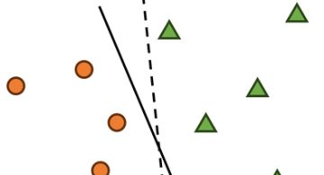
Any IT engineers, who have ever been pleased by the conciseness and flexibility of the regular expression (regex), must be exciting about the responsive layout patterns in the geometric visualisation of user interface.
According to the survey by Luke Wroblewski (http://www.lukew.com), there are 5 types of popular responsive layout pattern for multi-devices.
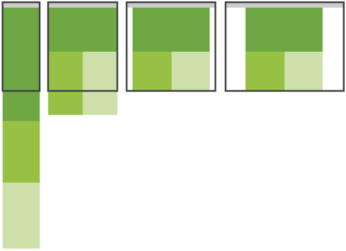
Mostly Fluid Pattern [Source: http://www.lukew.com]
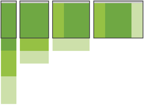
Column Drop Pattern [Source: http://www.lukew.com]

Layout Shifter Pattern [Source: http://www.lukew.com]

Tiny Tweaks Pattern [Source: http://www.lukew.com]

Off Canvas Pattern [Source: http://www.lukew.com]
| Pattern | Main Feature | Demo Site |
| Mostly Fluid | Core layout sustains until the smallest screen width | Princess Elisabeth Antarctica, ChoiceResponse |
| Column Drop | Overall size of elements in this layout tend to stay consistent | Wee Nudge, Ash Personal Training |
| Layout Shifter | Adapts across most screen sizes, simultaneously requires more work. | Performance Marketing Awards, The Boston Globe |
| Tiny Tweaks | Only suitable for very simply web site with only a few contents | Path, Design made in Germany |
| Off Canvas | Keep content or navigation hidden until either a larger screen size allows it to be visible or a user takes action to expose it | Barack Obama, Kaemingk Christmas 2012 |
Media Query
Since there is a variety of media display on the digital consumer products, the digital contents have to be responsive no matter of any media constrains from the display screen.
Media Constrain of Display Screen [Source: http://line25.com]
media_query_list: [, ]*
media_query: [[only | not]? [ and ]*]
| [ and ]*
expression: ( [: ]? )
media_type: all | aural | braille | handheld | print | projection | screen | tty | tv | embossed
media_feature: width | min-width | max-width
| height | min-height | max-height
| device-width | min-device-width | max-device-width
| device-height | min-device-height | max-device-height
| aspect-ratio | min-aspect-ratio | max-aspect-ratio
| device-aspect-ratio | min-device-aspect-ratio | max-device-aspect-ratio
| color | min-color | max-color
| color-index | min-color-index | max-color-index
| monochrome | min-monochrome | max-monochrome
| resolution | min-resolution | max-resolution
| scan | grid
The variety of media display indicates the importance of detecting the media constrain. A media query consists of a media type and at least one expression that limits the style sheets’ scope by using media features (see to aforementioned scripts), such as width, height, and color. Added in CSS3, media queries let the presentation of content be tailored to a specific range of output devices without having to change the content itself.
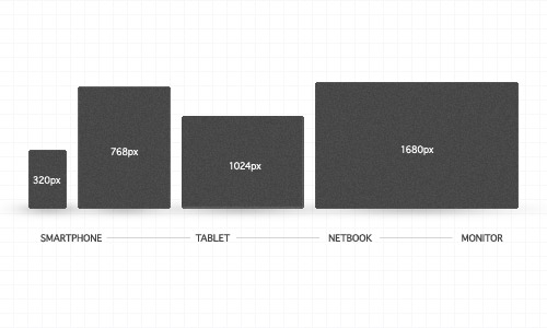
Taking the media feature of “device-width” for example, here listed the HTML/CSS media query for different types of media display, see to the sample sources as follows.
<!----- HTML ------>
<!-- In head of HTML, get the screen width from the width of the device-->
<!-- and initialise the scale to 1.0 -->
<meta name="viewport" content="width=device-width; initial-scale=1.0">
/*----- CSS ------*/
@media screen and (max-width: 320px) {/*Customised CSS*/} /* 320px portrait width of smartphones */
@media screen and (max-width: 768px) {/*Customised CSS*/} /* 768px portrait width of tablets */
@media screen and (max-width: 1024px) {/*Customised CSS*/} /* 1024px landscape width of tablets (and typical netbook resolutions) as well as various desktop monitor resolutions */
Responsive Design and Development
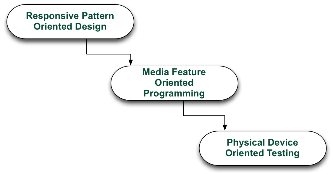
Responsive Design and Development
The picture above illustrates the working flow for the responsive design and development on multi-devices.The responsive layout patterns and media features can greatly help the complexity reduction during development, and it it is better to do the test on the physical device rather than simulator or resized browser.
- Tweet
-

 2024/01/05
 2023/08/18
 2023/07/14
 2023/05/12
 2023/04/21
 2023/04/19
 2023/03/24
 2022/12/23